Chime offer
before → after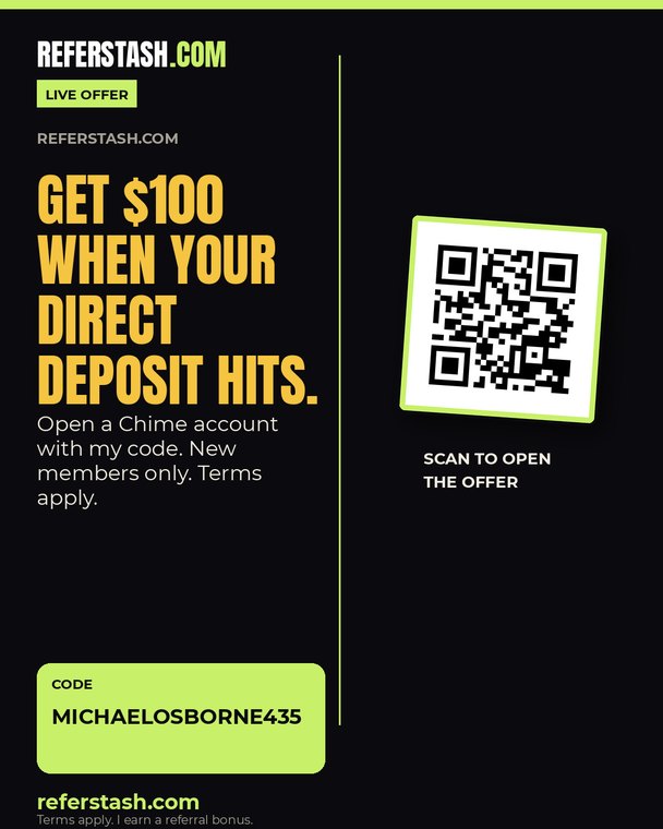
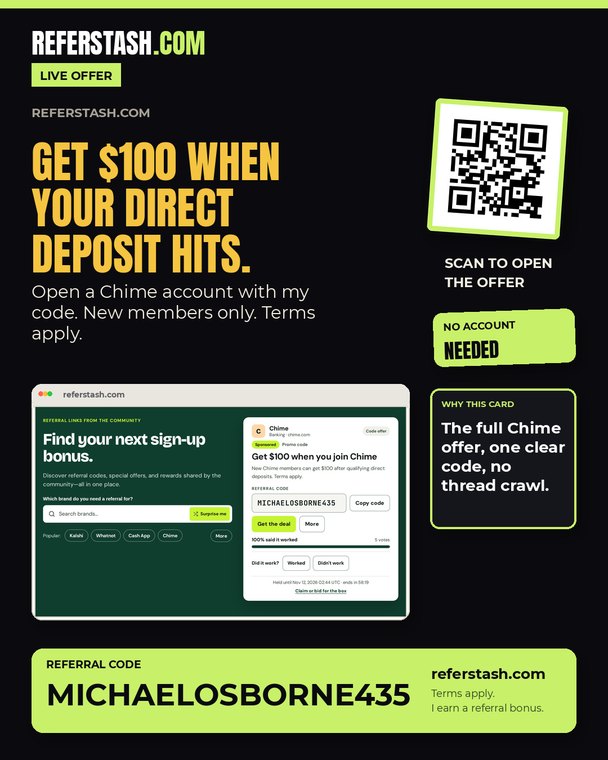
The old cards cropped section screenshots through the sides and left dead space in the middle. These ten examples use fresh full-width captures, show every screenshot at its natural aspect, and fill the 1080×1350 canvas on purpose. Nothing is cut off left or right, and the code is always complete.
Review note: the screenshots are from referstash.com on Nov 12, 2026. The rotating hero card includes a live countdown; regenerate the capture right before posting. Older cards are preserved in the comparison below and in the previous gallery. The scheduled queue is unchanged until these are approved.
Old cards on the left, new cards on the right. The new set keeps every screenshot inside the frame and fills the canvas.
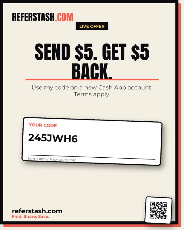
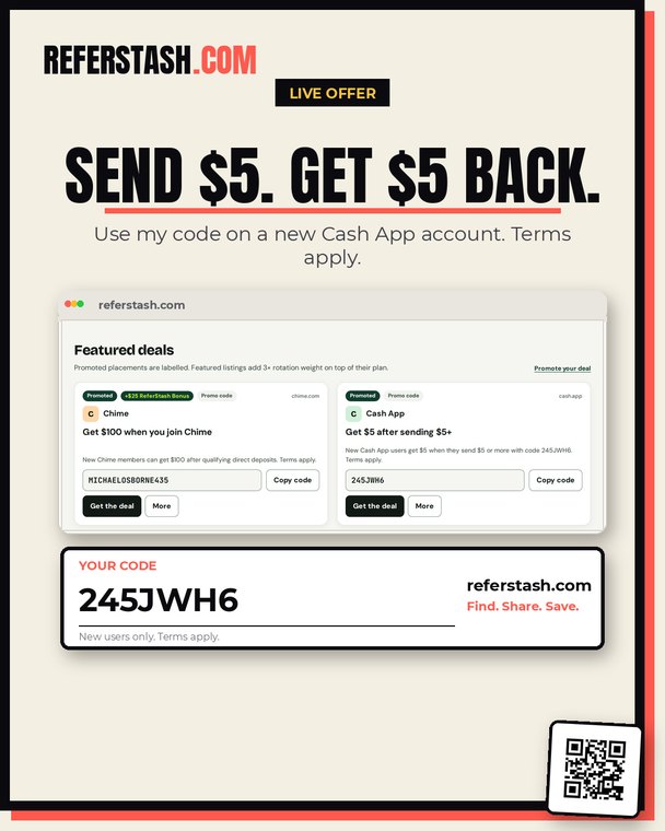
Ten cards, five styles: hero band, poster, terminal, editorial, collage. Click any card for the full-size image and the design note.
Fresh 1100px hero capture shown at its natural aspect. No sides cropped; code band fills the bottom.
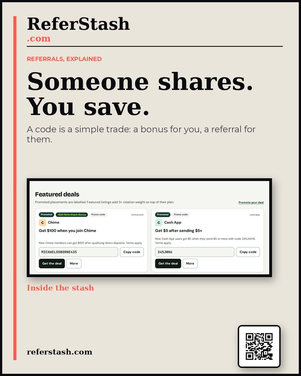
Featured-deals screenshot cropped vertically only; both offer cards stay whole. Less empty space above the code.
Terminal shrinks to its content and the live browse strip takes the space that used to sit empty.
Editorial layout is text-led for the code, then two seller notes fill the lower canvas.
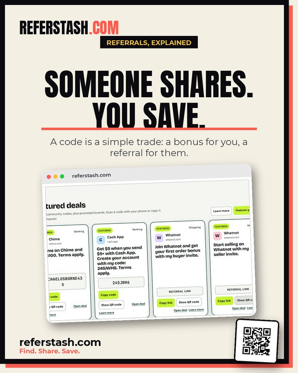
Featured-deals screenshot is shown whole in the tilted frame instead of a cropped phone.
Submit-form strip sits below the terminal; heading and fields stay fully visible.
The four-step explainer is captured at 820px so its text stays readable, full width, uncropped.
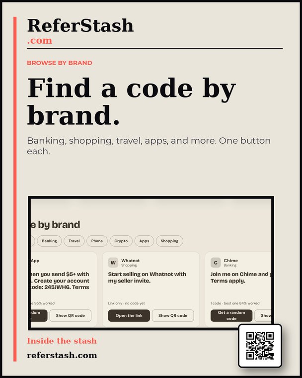
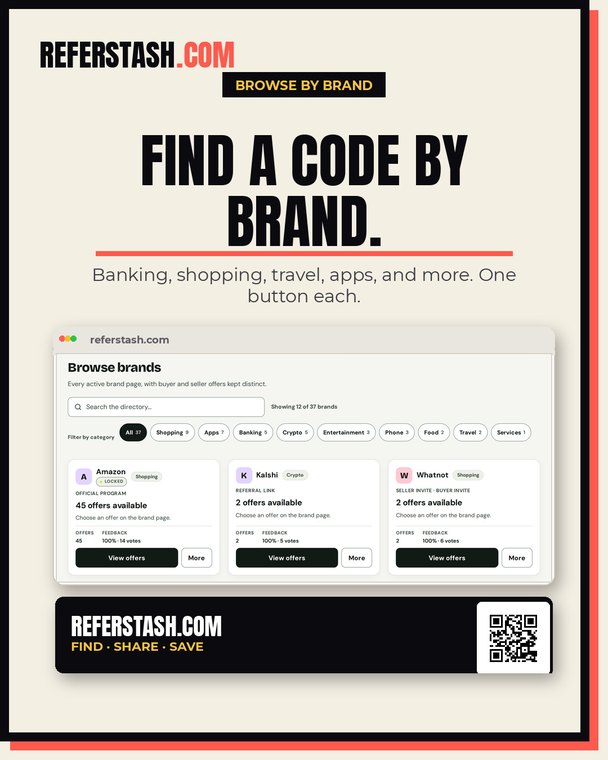
Browse strip keeps all three brand cards and the category chips inside the frame.
Featured deals fill the tilted frame; badge, QR, and URL anchor the corners.
Featured capture sits inside the paper frame with room for the caption and QR below; no clipping.